Best Flex Banner Design Ideas for Higher Brand Visibility
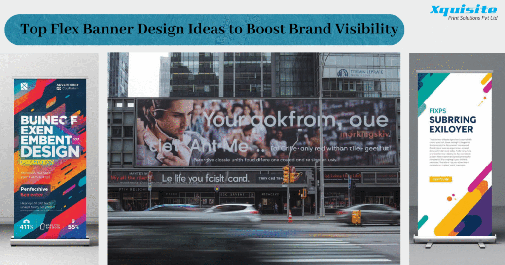
If you’re looking for a cost-effective and attention-grabbing way to promote your business outdoors, flex banners continue to be one of the most powerful choices. They are easy to print, durable in different weather conditions, and effective in reaching people on the move. But the real magic happens when the visuals are crafted thoughtfully. A well-planned flex banner design helps your brand pop out instantly and delivers your message in just a few moments—something crucial when people are passing by quickly.
To help you create banners that leave a strong impression, here are ten design ideas that can significantly enhance audience engagement and brand recall.
1. Use Bold and High-Contrast Color Schemes
Colors decide how quickly someone notices your banner. High-contrast combinations—like yellow paired with black, white with red, or deep blue with bright orange—help your message stand out even from a distance. These combinations increase readability and make your flex banner design more visible in crowded or visually noisy areas. A bold color palette can instantly grab attention while still staying true to your brand identity.
2. Choose Clean, Large, and Readable Fonts
Typography must support quick reading. Large, clear, sans-serif fonts are ideal for outdoor displays because they remain readable even when someone is far away. Limiting yourself to one or two typefaces keeps the text clean and prevents visual clutter. Simplicity in typography ensures that your flex banner design looks professional, well-structured, and easy to understand at a glance.
3. Keep the Layout Minimal and Focused
Minimalism isn’t just a design trend—it’s a way to ensure your message isn’t lost in unnecessary details. A clean layout draws attention to your headline, offer, and call-to-action without overwhelming the viewer. White space works like a silent guide, helping people focus on the key parts of your flex banner design. In busy public areas, a simple arrangement makes information easier to read.
4. Use Sharp, High-Quality Images
Poor-quality images instantly reduce trust. Sharp, high-resolution photos—whether product close-ups, lifestyle visuals, or brand-related images—make a big difference. Crisp visuals create emotional appeal and enhance brand credibility. When paired with the right colors and layout, high-quality images strengthen your flex banner design and help customers form a quick connection with what you’re offering.
5. Highlight Strong Branding Elements
Your banner should reflect your brand identity clearly. This includes your logo, primary brand colors, tagline, or any signature design element you consistently use. Placing your logo strategically—often at the top corner or bottom right—ensures it gets noticed without distracting from the main message. Consistency across multiple banners builds recognition, making your flex banner design more memorable over time.
6. Add a Clear and Compelling Call-to-Action
A banner is more effective when it encourages viewers to do something right away. Whether your CTA is “Call Today,” “Visit Us,” “Order Now,” or “Limited Time Deal,” it should be short and visible. Placing the call-to-action in a noticeable spot helps guide viewers toward the step you want them to take. A good CTA enhances the purpose of your flex banner design and increases the chances of conversion.
7. Use Icons and Visual Cues for Quick Understanding
Icons make information easier to scan. A phone icon, location pin, discount badge, or simple service symbol helps people recognize key details instantly. Visual cues break up text and add a modern touch to your layout. When balanced correctly, icons make your flex banner design more organized, visually friendly, and fast to understand—especially for busy viewers.
8. Add Seasonal or Festival-Themed Elements
People naturally respond to visuals that match the current season or cultural events. Incorporating festive patterns, thematic illustrations, or subtle seasonal symbols makes your banner more relatable. This approach adds freshness and helps your message feel timely. Whether it’s holiday sales, summer discounts, or festival promotions, adding these elements keeps your flex banner design lively and appealing.
9. Experiment With Different Shapes and Orientations
While horizontal banners are common, trying other formats can help you stand out. Vertical banners, square layouts, tall standees, or long strip banners can be more effective depending on where you place them. The environment—storefronts, roadside areas, entrances, or indoor corners—plays a big role in choosing the right shape. Using unique orientations can make your flex banner design more noticeable amid traditional setups.
10. Establish a Clear Visual Hierarchy
Visual hierarchy helps guide the viewer’s eyes in the right order. Typically, the headline should be the most prominent, followed by the key information, imagery, and CTA. Using size, color contrast, spacing, and boldness strategically helps you highlight what matters most. When arranged properly, hierarchy strengthens your flex banner design and ensures your message is remembered.
Conclusion
A flex banner is much more than a printed sheet—it’s one of the most accessible branding tools you can use to influence public perception and capture attention quickly. By focusing on bold colors, readable text, clean layouts, strong visuals, and consistent branding, you can create banners that communicate clearly and effectively. Implementing these ten ideas will help your flex banner design shine, attract more customers, and reinforce your identity in a competitive environment.
These principles will not only boost visibility but also build stronger brand recognition—something every business needs in today’s fast-paced world.